

In our last article, we investigated the MACD Line feature of the MACD and the historical patterns over the past few years using three common indicator settings.
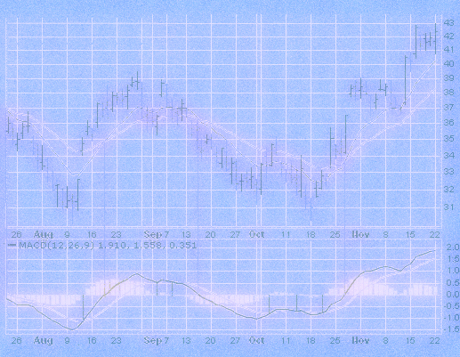
In this article, we are going to continue that analysis by studying the MACD Histogram, a feature that was added to the MACD indicator in 1984 by Tom Aspray. The Histogram is the difference between the MACD Line and the Signal Line. The Signal Line is a moving average of the MACD Line and the MACD Line is the difference between two moving averages.

Generally, the moving averages that compose the MACD Line are exponential moving averages (EMAs). Similarly, when Gerald Appel developed the MACD in the late 1970s, the Signal Line was an EMA, not a simple moving average (SMA).
At some point, in Forex platforms, the default setting for the moving average type for the Signal Line of the MACD became an SMA. We can see this in MetaTrader 4 , where the default settings for the native MT4 MACD Signal Line, iOsMA, is set to an SMA. The same goes for FXCM’s Tradestation. In stock trading applications, the default is consistently an EMA (Etrade, eSignal, Scottrade, Tradestation).
Without a strong reason to move away from an EMA and towards and SMA, we are going to stick to using an EMA for the MACD Signal Line. An EMA is more responsive than an SMA; weighting the most recent data more heavily and is thus more responsive to changing market conditions.
Generally, the MACD Histogram is used as a momentum indicator. When the MACD Signal Line crosses below the MACD Line, which means the Histogram is negative, it is a good time to sell. Conversely, when the MACD Signal Line crosses above the MACD Line, and the Histogram is positive, it is a good time to buy.
To test this hypothesis on the EUR/USD, we can use TRAIDE to quickly plot the empirical data for the same three commonly used MACD settings we used in the previous article; 12-period fast EMA, 26-period slow EMA, and 9-period signal EMA, 19-, 39-, and 9-period EMAs, and 10-, 20-, and 5-period EMAs. We are going to use 1-day bars from 01/01/2012 to today. This gives us just over 1,000 trading days in our sample.
The first thing we do is open TRAIDE and select our data:
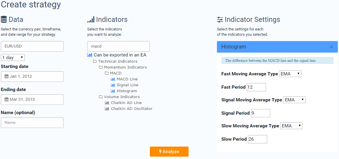
Then we simply click “Analyze”.
TRAIDE will then display the distribution of data. In the histogram below, I colored the green bars dark green, the red bars dark red, and the middle two bars gray, so we can more clearly see the distribution of data without TRAIDE’s signals and without any ambiguity.
The x-axis is the value of the MACD Histogram split up into bins. The y-axis is the number of trades for each histogram bar in each bin. For example, the bin marked by -0.00059 on the left and 0.00059 on the right had about 120 instances where the following day’s close price was higher than the previous day’s close and about 115 days where the following day's close price was less than the previous day’s close.
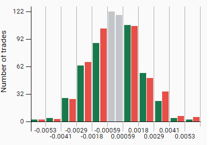
Just like in the previous article, we want to first ignore the ambiguous data. The bin -0.00059 to 0.00059 contains days that have either a positive or negative MACD Histogram value. We will ignore those values for the purposes of this study.
To test our hypothesis, we want to go long when the histogram was above 0 and go short when it was below 0. To do this we simply click on all the green bars that are positive and see if we were greater than 50% accurate. The same goes for testing short trades. We simply select all of the red bars in bins that are negative and see if we were over 50% accurate. The statistics table below the histograms in TRAIDE will display accuracy.

From the data, we cannot reject our null; when the MACD Histogram is positive, the following day is no more likely to close up than down. In fact, it was more likely that the following day closed down rather than up. When the MACD Histogram was negative, 52% of the following days closed down. This indicates that there is a historical pattern for going short. My concern is that the EUR has been significantly depreciating against the USD recently and I was only 52% correct over the most recent data for this reason.
If we take a look at a 1-day EUR/USD chart, we can see how well we would have done assuming we went long when the MACD histogram was above 0.00059 (the green line) at the open of the bar and short when the MACD was below -0.00059 (the red line) at the open of the bar, as well as the cumulative performance of both strategies (the orange line).

What we see is that we had relatively flat performance when we simulated going long when the Histogram was positive and short when it was negative, until very recently. What I am looking for is consistent accuracy over my whole date range.
It seems there is no consistent, historical pattern using the default parameters, 12-, 26,- and 9-period EMAs, for the MACD Histogram on 1-day data. Let’s try Tom Aspray’s most popular settings, 10-, 20-, and 9-period EMAs, to see if we can find a historical pattern over the same pair, timeframe and date range.

Let’s check out the distribution of data:

I grayed out the ambiguous data and colored the bars dark red/green for convenience. Right away, it does not look like there is an obvious pattern.
Let’s select the positive bins to go long and negative bins to go short:

Similar results to our first analysis using the 12-, 26-, and 9-period EMAs.
Since these tests are easy to run, I analyzed a few more commonly used MACD settings from other reports. I could not seem to find a consistent pattern over the past few years of data for the EUR/USD 1-day bars. Some of the MACD settings I tried: 19-, 39-, and 9-period EMAs, 10-, 20-, and 5-period EMAs, and 19-, 39, and 5-period EMAs. For every set of parameters I went long when the Histogram was positive and short when it was negative.
For all of the settings, I was unable to find a consistent pattern in the MACD histogram from 01/01/2012 to 03/30/2015 by analyzing the distribution of empirical data.
There are a few potential reasons for why we were unable to find a consistent pattern on 1-day data. The MACD Histogram was developed with commodities in mind and the MACD Line and Signal were developed for equities and stock indexes. These assets trade inherently differently from each other and from Forex. Most likely, the MACD settings were optimized for these assets and timeframes. To use the MACD Histogram, we want to make sure we are analyzing and building our strategy over the same data we are going to see in the future.
If you have been following our webinars and some of the strategies that we have published, our analysis generally points to the MACD Histogram as a great indicator to identify overbought and oversold conditions when used on the major currency pairs. Tad Slaff steps through a MACD Histogram and CCI strategy where he found the Histogram could be used as a mean-reversion indicator. Additionally, I found similar results in a USD/CAD strategy, where the Histogram acted as a great filter for trend-reversals. Let’s dive a little bit deeper into a shorter timeframe to see if we can find a historical pattern.
From my own experience, I have found that the MACD Histogram is successful on shorter timeframes in finding opportunities that go against the trend rather than as a momentum indicator for trading in the direction of the trend.
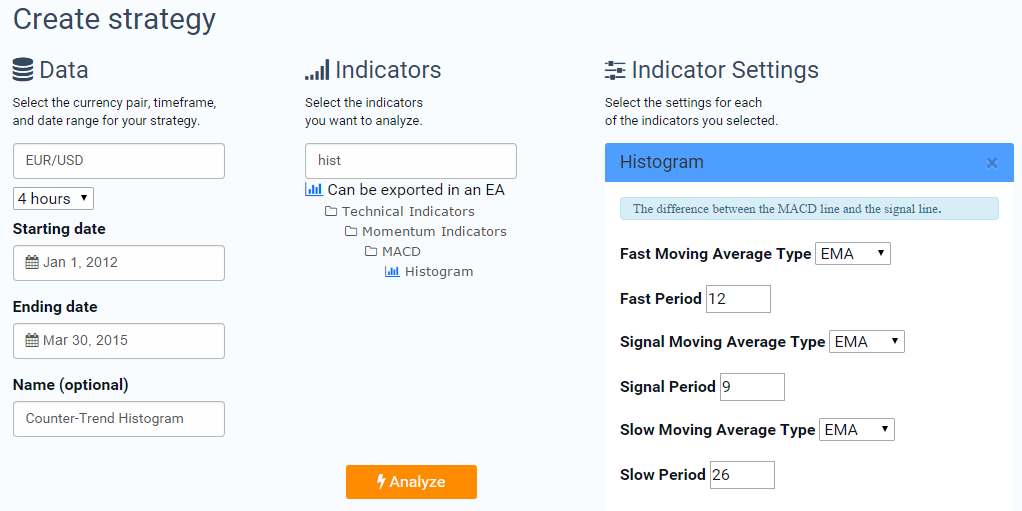
To analyze 4-hour bars, I just tweak the timeframe in TRAIDE: I am going to use the MACD Histogram with default settings (12-, 26- and 9-period EMAs) on EUR/USD 4-hour bars from 01/01/2012 to 03/30/2015. Using 4-hour bars gives us the added benefit of a much larger sample size. To analyze the data, I simply select it in TRAIDE and click “Analyze”.
And here is the distribution with the ambiguous data grayed out and the bars all colored dark green or red for visual clarity:

Right off the bat, we can see that when the Histogram was negative, there were more bars that closed up than down and when the Histogram was positive, there were more bars that closed down than up- which indicates there is a historical pattern favoring the Histogram as a counter-trend indicator.
There are about 5,300 4-hour bars from 01/01/2012 to 03/30/2015. Let’s simulate going short on all the bars above the Histogram value of 0.00035 and going long by clicking all of the green bars where the Histogram value was less than -0.00035.
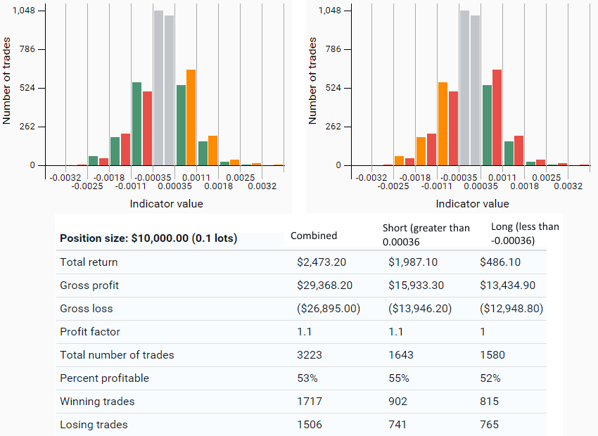
55% percent of the time that the MACD Histogram was greater than 0.00035, the following 4-hours closed lower than the previous close (1,643 times). 52% of the time that the MACD Histogram was less than -0.00035, the following 4-hours closed higher than the previous close (1,580 times).
Further, if we look at the bars that are just positive and just negative and ignore where the Histogram has a higher absolute value or, in other words, where the Signal Line is diverging from the MACD Line, there is an even stronger counter-trend pattern.
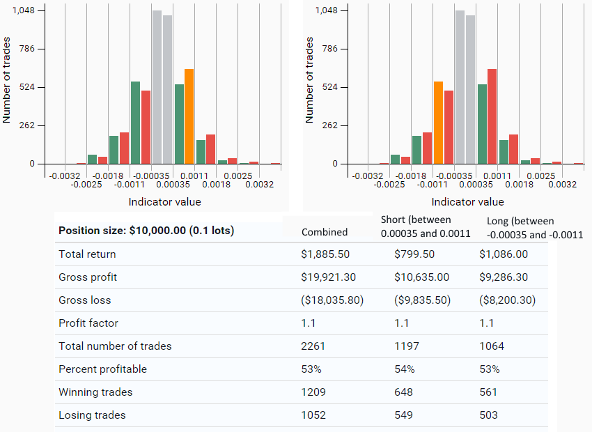
If we simulate going long when the MACD Histogram is between -0.00035 and -0.0011 we are correct 53% of the time (1,064 bars) and going short when the MACD Histogram was just positive, between 0.00035 and 0.0011, we were correct 54% of the time (1,197 bars).
We could not find a historical pattern on the EUR/USD 1-day bars using the variety of commonly used MACD Histogram settings that we used. It is often best to incorporate our own domain expertise and experiences to build our strategies and this is exactly what TRAIDE is good at. TRAIDE will allow you to test and build strategies based on your own intuitions.
In this case, I commonly use the MACD Histogram on lower timeframes than 1-day bars, like 4-hours, on major currency pairs like the EUR/USD. I typically use the Histogram as a counter-trend feature of the MACD rather than a momentum indicator and, using TRAIDE, I was able to support my theory with data. Using TRAIDE, we were able to demonstrate that there is a historical pattern to the MACD Histogram.
This information could be used to filter out trades you are unsure of or as the first entry criteria for your trades.