


In the last post, we covered how to evaluate the profitability and risk of your strategy. Now let’s take a look at measuring the Statistical Significance, Stability, and Live Performance of your strategy.
After running your backtest one of the first questions you need to be asking yourself is “are these results statistically significant?” or, in other words, “what are the chances that these results occurred solely by random chance?”
While diving into the world of statistical analysis can be daunting, there are some fairly straightforward techniques to get a better idea of whether or not you have actually found a repeatable, exploitable pattern in the market.
Confidence Intervals One benefit of turning to statistical analysis is that you can get concrete confidence intervals on your results.
Taken from the CFA study guide, we can use the t-distribution to calculate the confidence intervals around our return per trade (RPT). The t-distribution gives us a conservative estimation of how likely an average is to fall within a given range. It works particularly well when we have small sample sizes, don’t have a lot of information about the distribution of the underlying data, and has “heavier-tails”, meaning a higher likelihood of large moves. This lends itself very well to working with financial data.
Luckily, we can easily calculate the t-distribution in Excel with the “TDIST” function, which looks at your degrees of freedom (sample size - 1) and whether it’s a one-tailed (you only care about finding the lower boundary) or a two-tailed test (you care about finding the upper and lower boundary).
What this calculation will tell us is: “With 95% confidence, my return per trade will be above ___ and below ___”. To decrease the range of the confidence interval, you can either increase your sample size or decrease your confidence interval to 90%.
You want the lower boundary to be at least enough to cover your trading costs.
Monte Carlo Simulation
This is another popular one that you hear a lot about but still isn’t employed by the average trader.
What the Monte Carlo simulation tells you is, “had I run a huge amount of strategies, randomly going long and short for each trade, what is the chance the to total returned at least as much as my strategy?
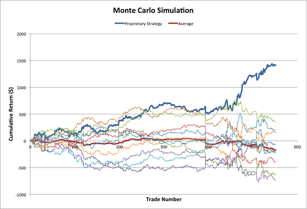
For example, if your “proprietary” strategy had returned 20%, but you find that a completely random strategy had a 50% chance of returning at least that amount, you aren’t going to be very confident with your strategy moving forward.
Here is one good resource on how to apply a Monte Carlo Simulation in Excel but before blindly trusting it, there are a couple things to consider.
This a very brief overview of only two ways you can measure the statistical significance of your strategy. There is a lot more quantitative research in this area and I would highly recommend Evidence-Based Technical Analysis by David Aronson as a trader-friendly reference to these types of techniques.
The stability of your strategy refers to the consistency and predictability of your returns. This is related to both the strategy’s risk and statistical significance, but I think it is important to view it as its own category.
When we talk about a strategy being stable, we want to look at how the strategy performed across a variety of market conditions, whether a majority of the returns came from only a few trades and how susceptible the strategy is to large drawdowns.
Most traders look at this as “the smoothness of the equity curve”.
Measuring “Smoothness”: “R²”, the coefficient of determination, measures how well a data set fits a particular model, in this case a simple line or curve. To measure the smoothness of our returns, we are looking find out how well our equity curve fits a straight line.
In a perfect world, our equity curve would be a steep, straight line going from the bottom left corner to the top right (we could always hope for a exponential growth, but let’s not get ahead of ourselves).
What the coefficient of determination tells us is close to this straight line our equity curve falls. We are looking for a high determination coefficient (meaning our equity curve is a close fit) and a steep slope (meaning our equity is growing at a fast rate). These two measures help us objectively analyze how “smooth” our equity curve is.
In Excel, this is very easy to do. Plot your equity curve as a scatter plot, right click on one of the points, and select “Add Trendline”. In the dialogue box, select a “linear” trendline, then under options set the intercept to be 0 and click to show both the equation and R² value.
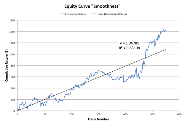
The “m” value in front of the x will show you the slope of the line (we are looking for high positive values) and the R² value is close we are to that line (values over .7 are what we’re looking for).
Just like that, you have all the information you need to measure the smoothness of your equity curve!
Market Condition Testing: Another aspect to consider is under what market conditions our strategy tended to perform well and under what conditions it performed poorly. This can help you get a better feel of the characteristics of your strategy as well help when you start trading live.
There are two basic ways to look at this; the simple way and the slightly more complex way.
In the simple way, you would define the different market conditions yourself using indicators as filters. For example, you would decide that the market is trending when the ADX is over 25 and volatile when the ATR is over 1.0. You might see that 80% of your returns came when the market market was in a strong trend (ADX > 25) and you had losses when the market was flat or moving sideways. You can then use this information to try to improve your strategy or add these filters when you go trade live. Here is more information on what these indicators mean.
It is important to remember that these filters should be as uncorrelated as possible with the logic used to create your strategy. If you are using a technical indicator that incorporates the strength of the trend, adding a trend filter doesn’t tell you much more about your strategy besides adding another entry condition.
The slightly more complex way involves our old friend, the regression, except now we are running a multiple regression and we are less concerned with the R² values as we are concerned with the beta coefficients of our indicators.
Once again, we’re going to choose indicators to identify different market conditions, but instead of defining the different levels (ADX > 25 = trending), we are going to let the regression show us which factors were most important.
Larger coefficients will tell us which indicators had the largest impact on our returns, though we want to be sure to standardize the indicators and make sure that the results are statistically significant.
Here is a great video by Business Insider on running a multiple regression in Excel. (If you are using a Mac, you are somewhat handicapped and must use the LINEST() function which will require an extra step calculate the p-value. Here is a video on how to use the LINEST() function for a multiple regression and here is how to calculate the p-value from the results.)
This isn’t going to give us clear-cut filters but we are able to easily test a larger number of indicators and get a good understanding of what factors played a role in our returns. Once again, we want to be sure we only use filters that are uncorrelated with the indicators used to create our entry signals.
Measuring the stability of your returns is an important consideration when evaluating a strategy and while “eyeballing” the smoothness of the equity curve is always a good idea, using a more objective, quantitative approach is desirable when comparing multiple strategies.
Once you have tested a strategy and go to trade it live, the next big question is “how do I know when this strategy has fallen out of sync with the market?”
Knowing when to stop trading a particular strategy can have a huge impact on the overall returns of your portfolio.
Trending Equity: One way to look at the returns of your strategy once you start trading live is by measuring the “trend” of these returns. Obviously we want an equity curve in a positive trend.
A simple, visual way to do this is by calculating a simple moving average (SMA) of your returns. When the equity curve dips below the SMA and enters a downtrend, you might want to look to either stop trading the strategy or decrease the position sizes.
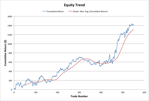
There are two parameters to consider when using this approach: the period of the SMA and how you define a downtrend.
These parameters can be chosen by a combination of historical performance and your own risk tolerance.
You want to select the period of the SMA that gives a good buffer between your backtesting returns and the SMA. A longer period SMA will lead to larger buffers, while shorter periods are going to make your equity curve more likely to dip into your SMA. I have found SMA periods between 25 and 100 to be most effective depending on how often you strategy trades.
How far below the SMA the equity curve dips before you stop trading should be more than what you observed in your backtests but not too much where you risk losing a large amount of your capital. You should look for at least a 10% or greater dip than what you saw in your backtest before stopping the strategy.
It is reasonable to expect that your live performance won’t be as good as the historical performance so you want to be sure that your returns are actually in a downtrend before discontinuing the strategy.
Consecutive Losses: A more sensitive way to know when your strategy is falling out of sync is by looking at the probability of having a string of consecutive losses.
For example, let’s say you have had 20 trades and are in the midst of a string of 5 consecutive losses. Based on your historical accuracy, what is the probability that this would happen?
Turns out this a more complex question than meets the eye and requires a fairly sophisticated recursive formula. Luckily, you can find a handy calculator here to do it for you or if you want to play around with the somewhat messy Excel calculations yourself, you can download the spreadsheet here. When using the online calculator, we are concerned with the streak of losses so the probability of success would actually be (1 - % Accuracy), so a strategy with 60% accuracy would have a 40% probability of a loss. (Special thanks to sci-fi writer/mathematician Max Griffin for the calculator).
What we can see is that if we thought our strategy was 75% accurate (25% probability of a loss) and we had a streak of 5 losses in only 20 trades, there is only a 1.19% chance of this happening!
If this is the case, you should take a hard look at your strategy as it shows that your 75% accuracy was most likely due to overfitting the data used to build your strategy and is not likely to hold up in live trading.
Properly evaluating your strategy is a crucial step that is often overlooked. Many traders spend huge amounts of time coming up with a strategy, and then rely on only a few basic metrics to decide whether to trade or discard the strategy.
Only by analyzing the profitability, risk, statistical significance, stability, and live performance of the strategy can we have confidence to trade it live.
What other metrics do you use when evaluating your strategy?
And be sure to check out TRAIDE to learn how you can leverage machine-learning algorithms when building your next strategy!
Happy TRAIDING!